
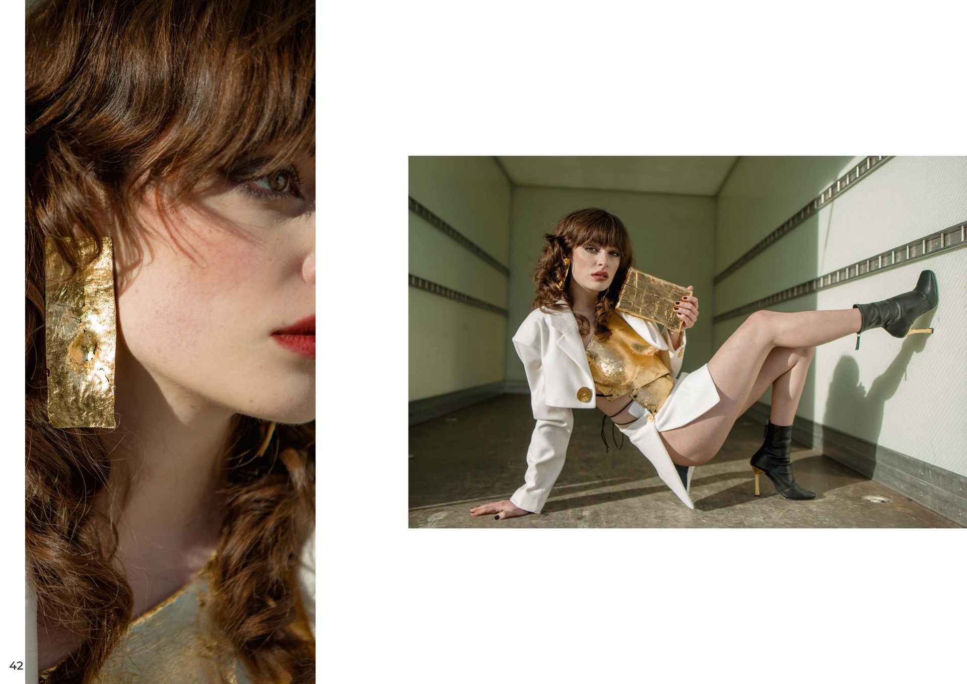
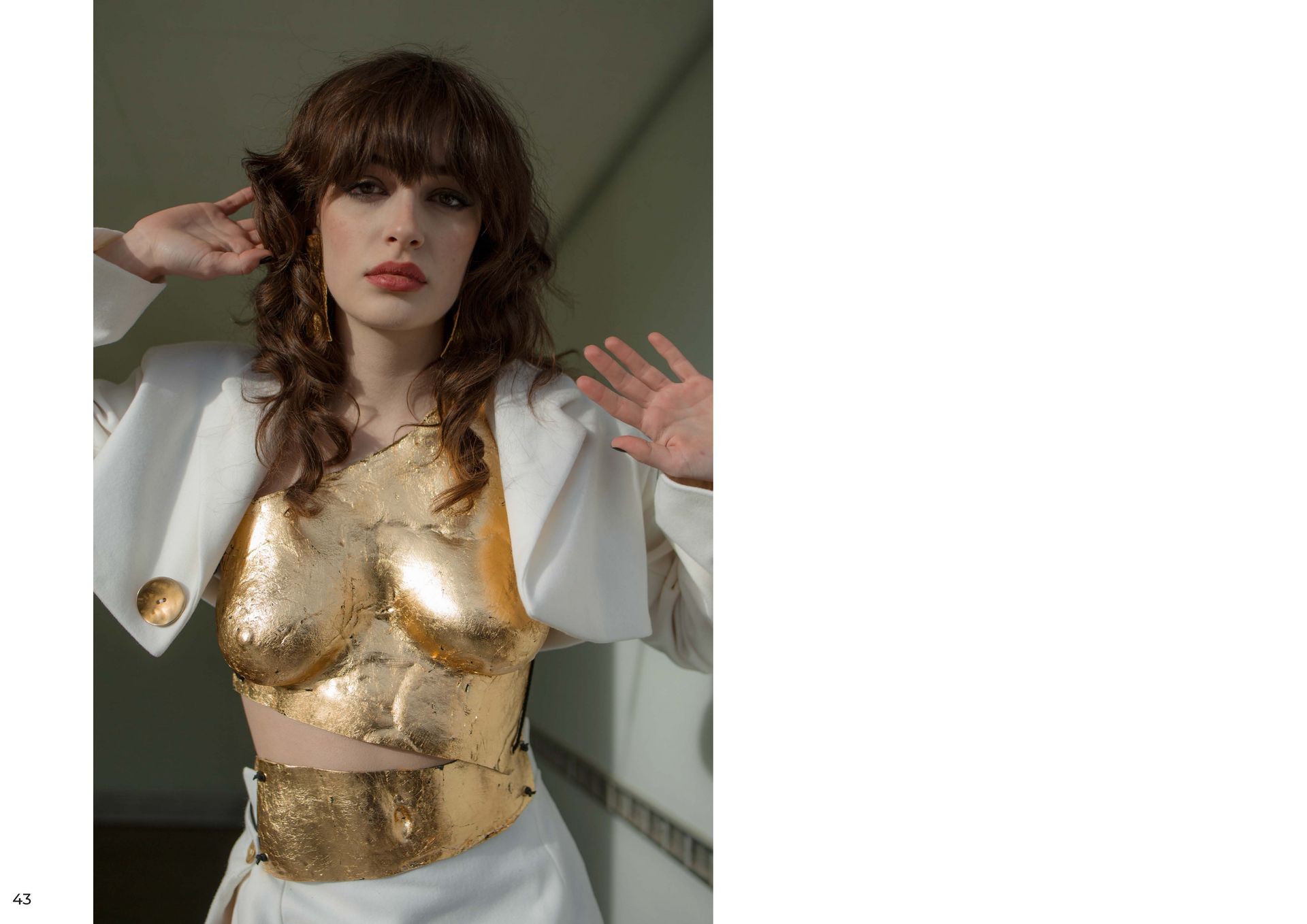
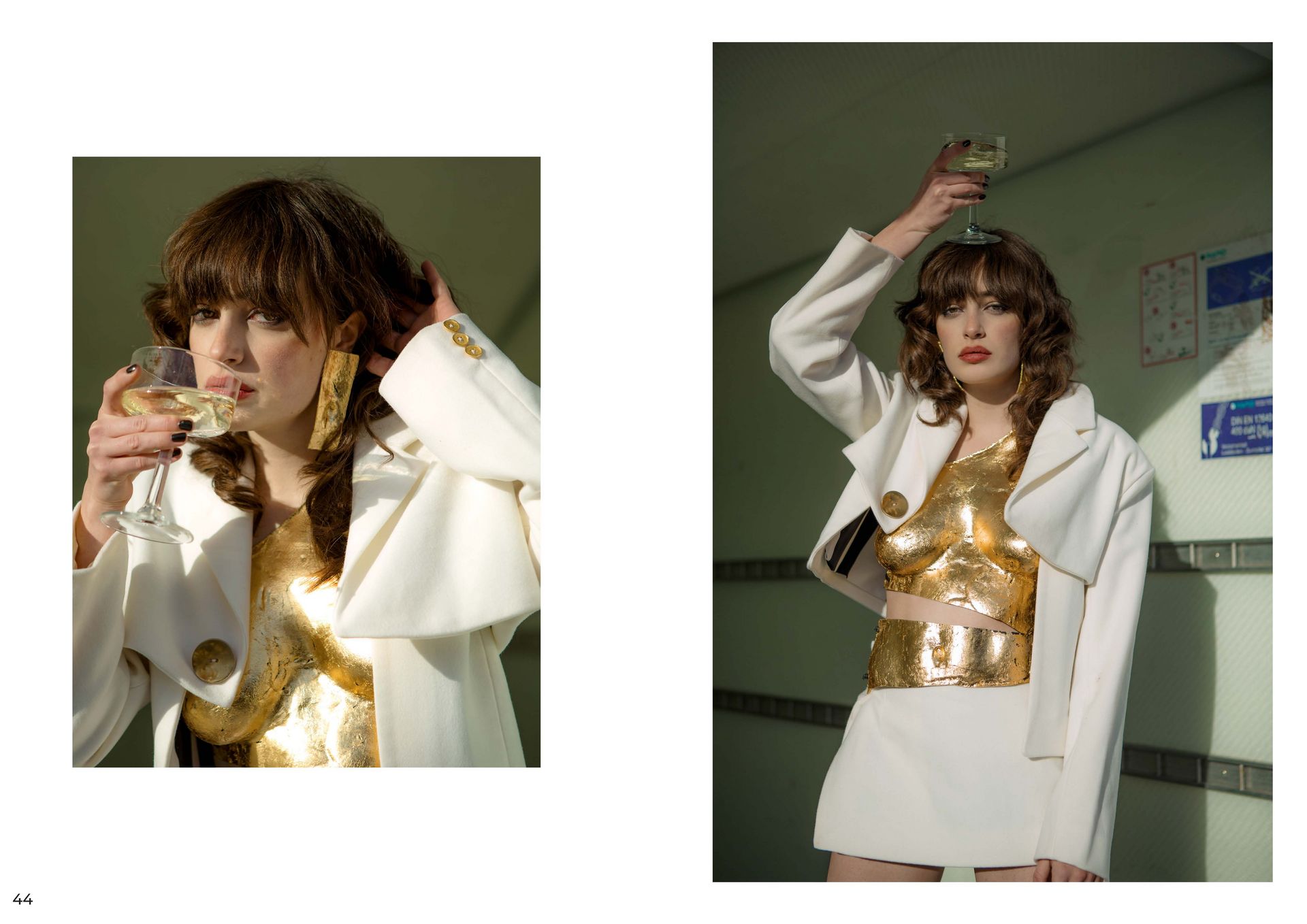
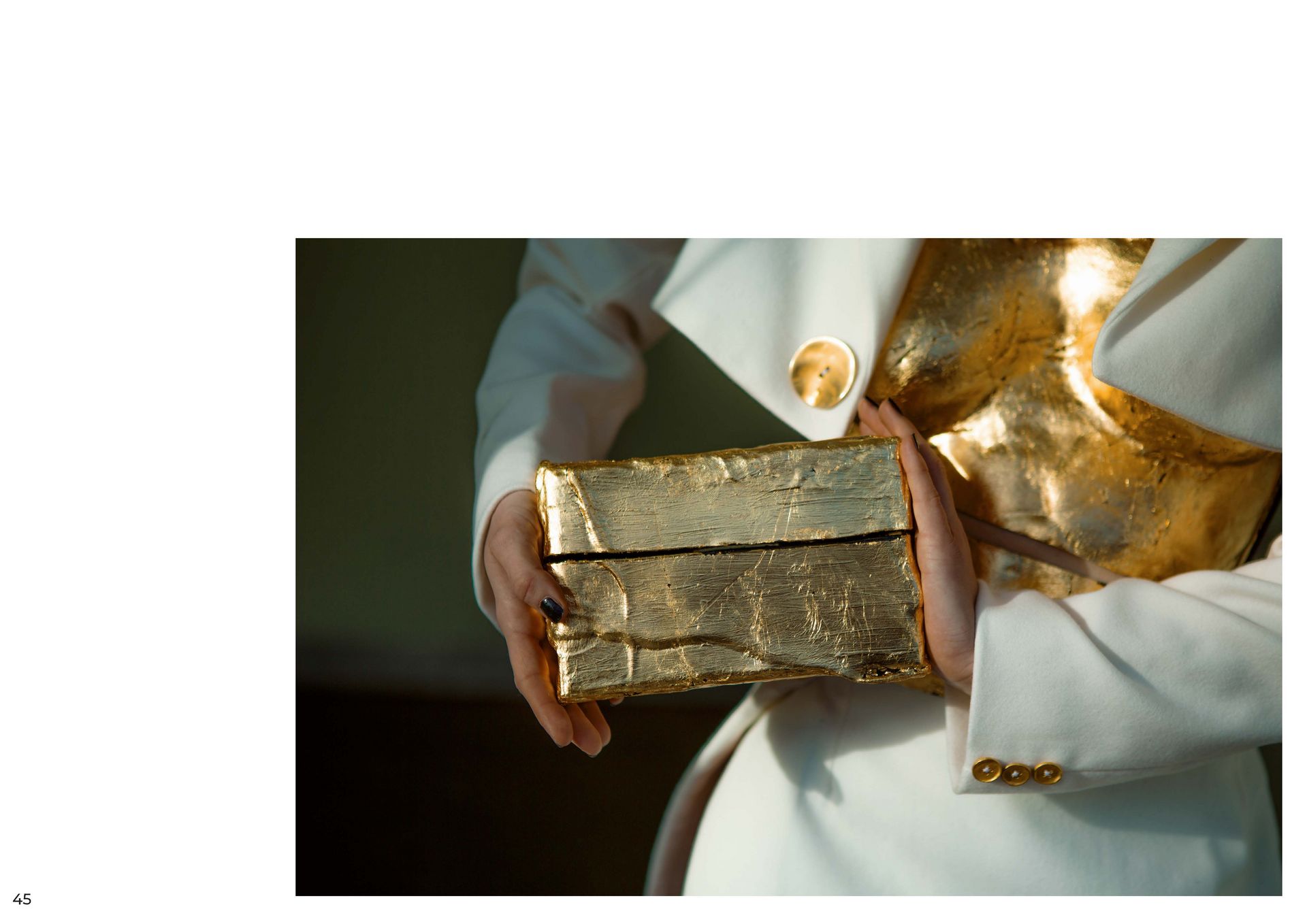
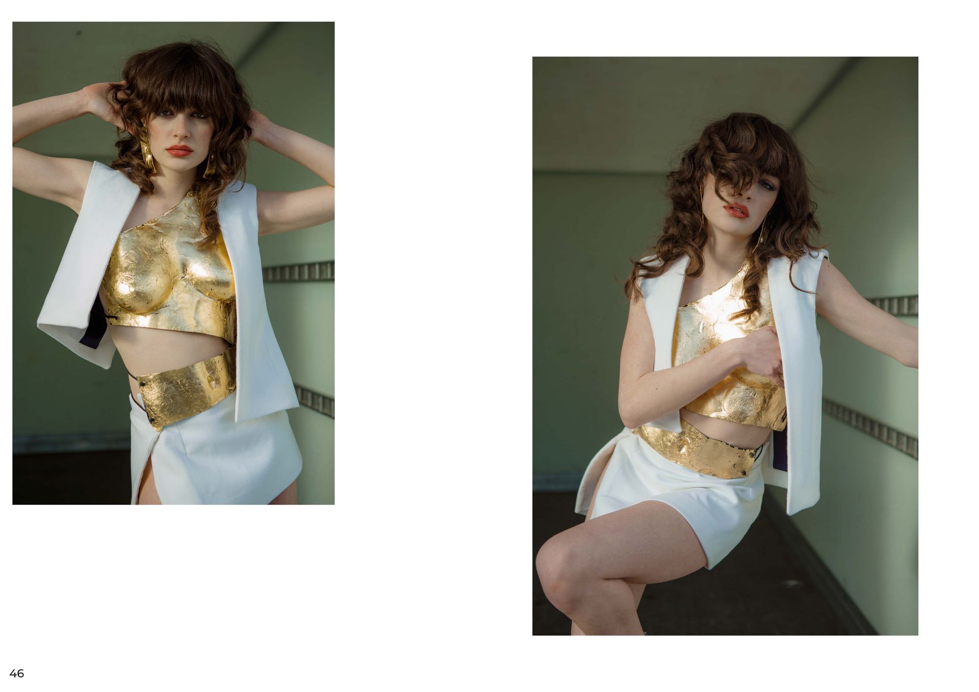
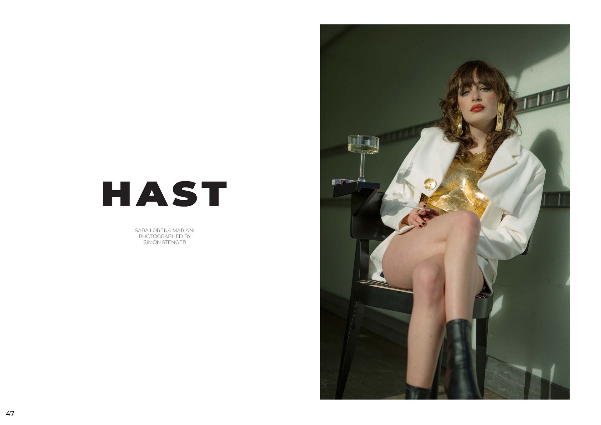
VOGUING X MEMPHIS MODERN STAGING, IS THAT POSSIBLE ? The main point here is to reinterpret the style that emerged in the 80s and lasted only a short time, into today's decade. To do this, however, one must first grasp and separate the abundance of styles that exist and collide today. In this regard, the ever-faster spreading minimalism seems perfect for reinterpretation as an obvious contrast to the strong, eye-catching colors of Memphis design. Looking more closely at Memphis design, the most noticeable features are strong opaque colors, and asymmetrical patterns and designs. The design of this movement was meant to break the conventional, shapes, paving the way to a much more individual world. To achieve this, the pieces were created from various elementary geometric shapes (cones, spheres, pyramids, cubes), they did without right angles as much as possible, and to some extent put functionality in the background, giving the design the upper hand.
Minimalism, on the other hand, completely renounces strongly striking colors and is oriented for the most part to earth tones, as well as individual restrained and less striking colors. Minimalism is characterized by its clarity and sobriety in the design, as well as in the color scheme. However, it is important not to confuse sobriety with boredom. Especially today in the overloaded world, be it fashion architecture or art, it is often the simple things that manage to win us over. Their clarity gives us a moment of peace and serenity, we are not disturbed by garish colors or far too exaggerated designs. On the contrary, minimalism time itself open and clear, the statement is understandable and yet not intrusive.
Now the problem arises to bring together these two, yet strongly contrasting styles and yet not lose the characteristic features of each movement. What these two design styles have in common, however, is their asymmetry, as well as their way of incorporating shapes into the designs. While this may seem outlandish at first glance, they both make use of the basic forms of geometry. To better understand and visualize this feeling, I looked at both architecture, interior design, art and design of these two directions and tried to develop a minimalist concept to portray my own design. The Jil Sander brand was particularly striking in this process. Both the designs of the products and the stores were strongly reminiscent of the characteristics of Memphis, but uses a completely different color palette.
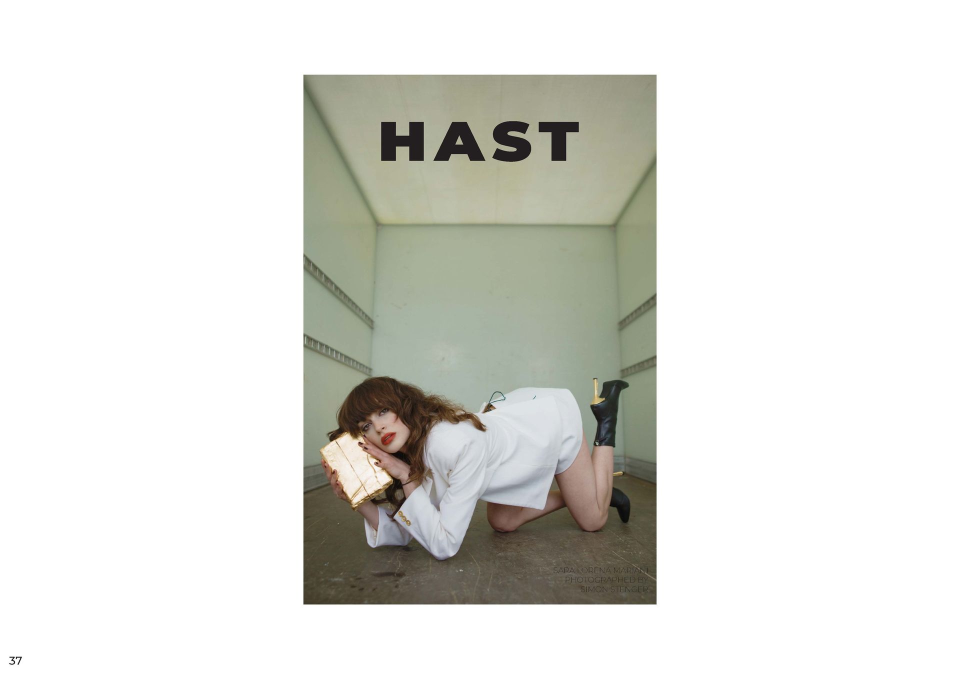
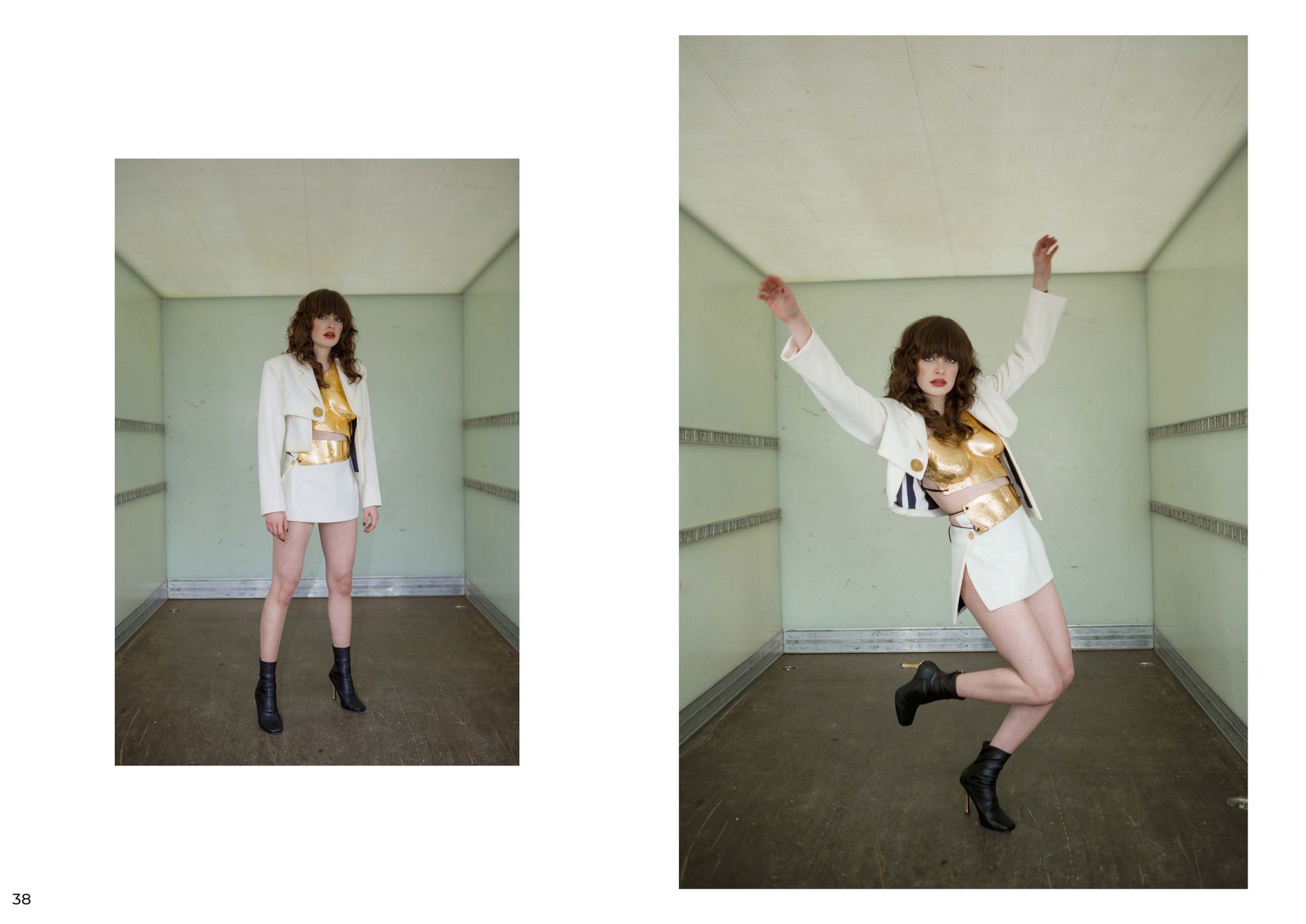
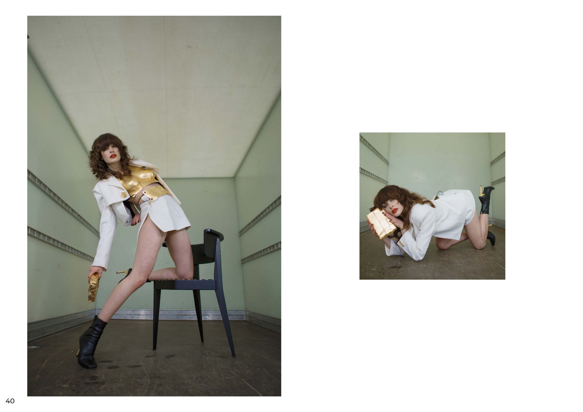
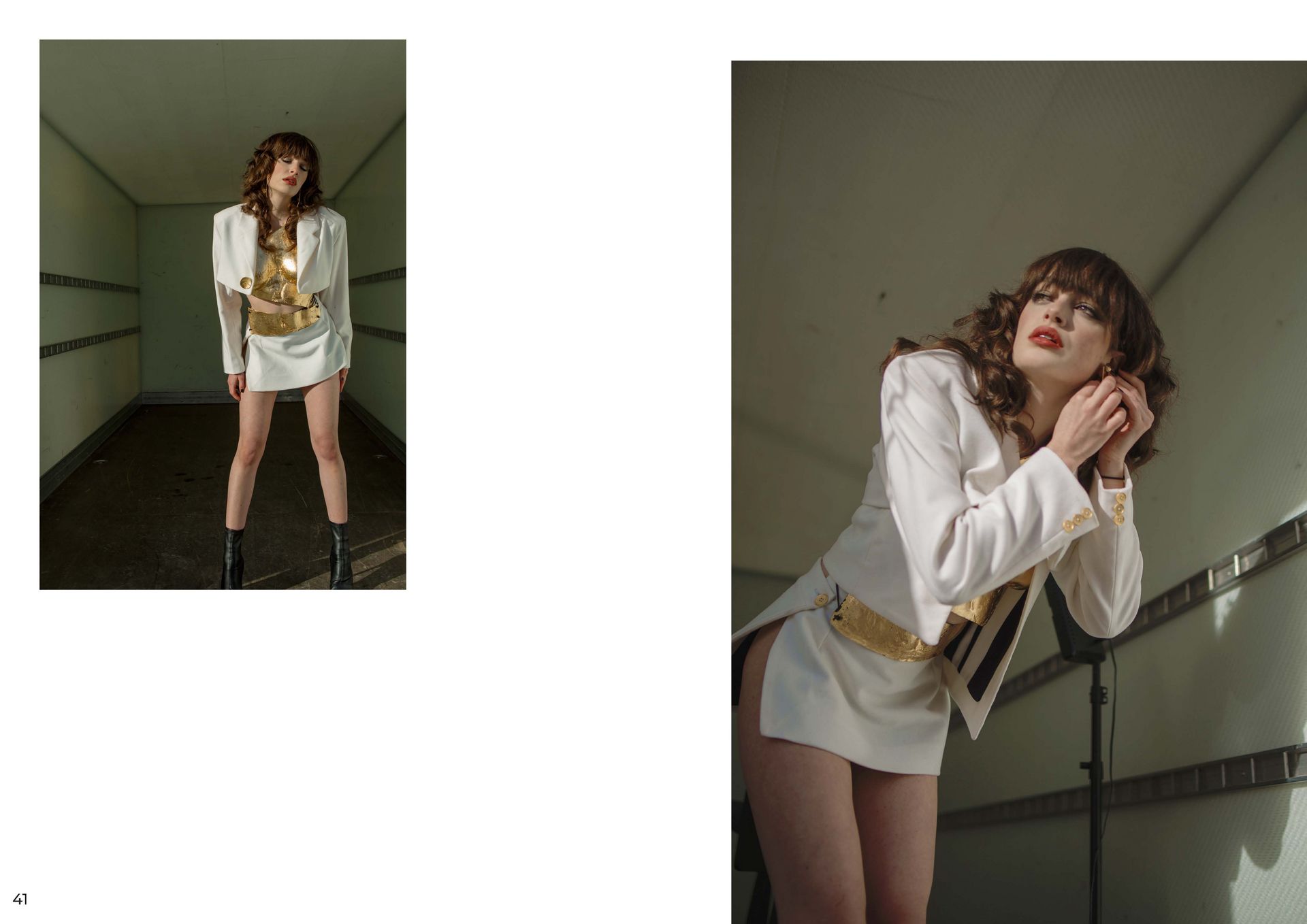
The designs of the stores are based on the colors black, white and beige and set individual accents with golden decoration (e.g. jewelry boxes). The designs are restrained and discreet, either in the colors of the store or in pastel shades ( blue, green, yellow, .. ). Now the task is to create a design from the various areas, such as interior design and art, which should pick up the points listed above, but at the same time include their own elements. The theme of Voguing mainly describes the posing and dancing in the ballrooms of the 70s, but originally comes from the extravagant poses on the covers of Vogue. The dances were very free and expressive, just like the looks of the participants. More was more. The outfi ts were exaggerated and extravagant, they were supposed to express something and show the world who you are. This strength, the openness, but especially the self-confidence both in the design, and later on the photos and the model to transfer is the goal.
THE GOLDEN PATH Joshua Hammer
MENTOR Professor Christian Bruns
3. SEMESTER BACHELOR

You are leaving the official website of Trier University of Applied Sciences